The Cartographer's Palette: Mapping Subtle Color Shifts in Antique Ribbons
There's a quiet reverence that settles when you hold a ribbon from a typewriter manufactured before World War II. It’s more than just a strip of material; it's a testament to a time when craftsmanship reigned supreme, when manufacturers poured meticulous attention into every detail, however seemingly small. We, as restorers and collectors, have a responsibility to appreciate, understand, and preserve these fragile remnants of the past. And a crucial part of that appreciation lies in recognizing and cataloging the surprisingly diverse palette of colors they represent—a palette as nuanced and captivating as a hand-painted map.
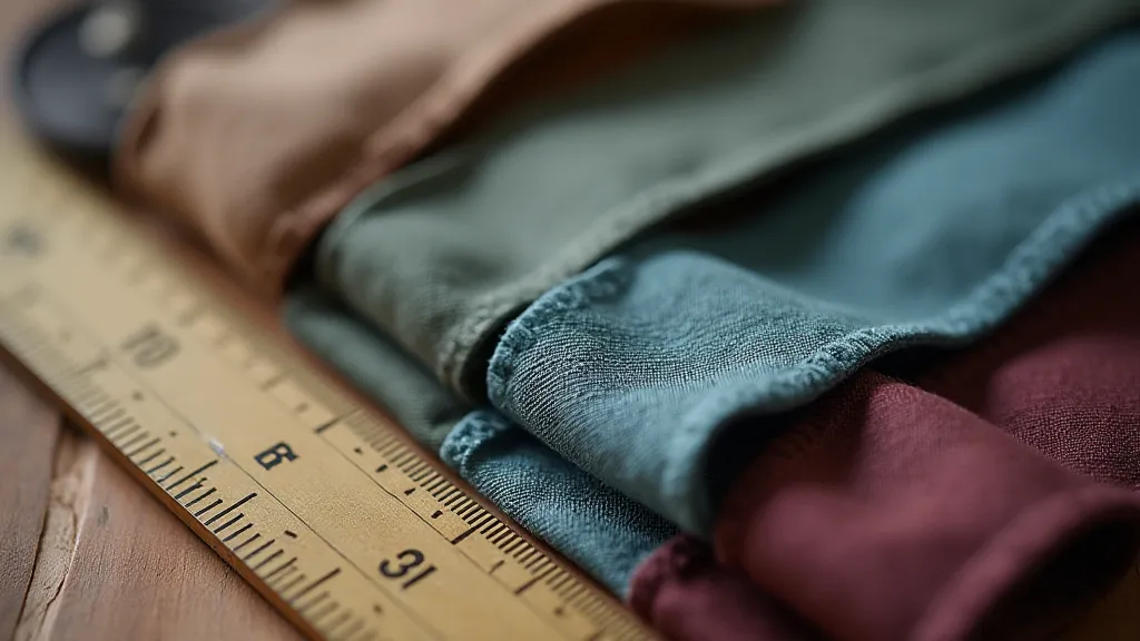
My fascination began years ago, not with grand restorations, but with a single Underwood No. 4, a gift from my grandfather. He was a meticulous accountant, and the Underwood, with its steady clatter and the satisfying *thunk* of the carriage return, was his faithful companion. He never threw anything away, and amongst his belongings, I found a box overflowing with old typewriter ribbons. They weren’t all black – far from it. There were deep burgundies, faded teals, dusky blues, and even a ribbon that appeared a peculiar shade of brownish-purple. They spoke of a world where choices extended beyond the purely functional.
The Alchemy of Ink: A Historical Perspective
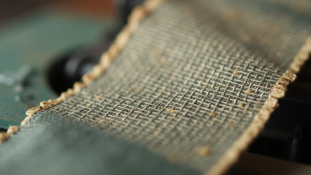
To truly understand these color variations, we must delve a little into the history of typewriter ribbon manufacturing. Early ribbons weren't simply dyed a single color. They were often the result of a complex chemical process, a sort of alchemy where aniline dyes, derived from coal tar, reacted with various compounds to create a spectrum of hues. The exact recipes were closely guarded secrets, unique to each manufacturer. Some factories experimented with different mordants—substances used to fix the dye to the ribbon fabric—further influencing the final color outcome. The quality of the raw materials themselves also played a part. Impurities in the aniline dyes, variations in the fabric weave, even the humidity of the manufacturing environment—all contributed to subtle (and sometimes not-so-subtle) color shifts.
During the early 20th century, the rise of mass production began to standardize many processes, pushing manufacturers toward darker, more universally acceptable colors, mainly black and dark brown. These colors were deemed less likely to smudge and were perceived as more professional for business correspondence. However, those earlier, more adventurous hues remain—a tangible link to a period of greater experimentation and artistic expression.
Mapping the Spectrum: Identifying Color Categories
So, how do we approach cataloging these colors? Just like a cartographer carefully charts a landscape, we need a system. We don’s need precise Pantone numbers (though those could be a fun, advanced project!), but a tiered approach based on broader categories works well. I’m not suggesting a rigid, scientific classification, but rather a framework for appreciating the differences.
Let’s start with the ‘Core’ colors: Black, Dark Brown, and Grey. These are the workhorses, the most common ribbons you'll encounter. Next comes the ‘Warm Tones’: Burgundy, Deep Red, Russet, and Copper. These are often vibrant, though age will invariably soften them. Following that, we have ‘Cool Tones’: Teal, Dusty Blue, and Violet. These colors often exhibit a more fragile quality, susceptible to fading and discoloration. Finally, there's the 'Unique' category. This is where the truly fascinating ribbons reside – those colors that defy easy categorization – the brownish-purples, the olive greens, the unexpected shades of pink.
When assessing a ribbon's color, consider not only the overall hue but also its saturation and brightness. A "burgundy" ribbon from one manufacturer might be a deep, saturated crimson, while another might be a more muted, almost brownish-red. Exposure to light and air over decades will also affect the appearance – fading, oxidation, and even slight discoloration can all contribute to the ribbon's final character.
Beyond the Hue: Understanding Color Degradation
It’s critical to understand that antique typewriter ribbons are inherently fragile. The dyes are often not lightfast, meaning they fade over time when exposed to sunlight. Furthermore, the fabric itself (typically a silk or rayon blend) is susceptible to damage – fraying, cracking, and even disintegration. This degradation isn't a flaw; it's a natural consequence of time and environmental factors. It's part of the ribbon's story.
Observe closely. A darkened ribbon might not simply be darker; it could be reacting with pollutants in the air. A faded ribbon might show uneven discoloration, indicating exposure to localized sources of light or heat. These subtle nuances can tell you a great deal about the ribbon's history and the environment in which it has resided.
The Collector’s Eye: Appreciating the Rarity
For collectors, rare colors represent a fascinating treasure. Teal ribbons are notoriously scarce, as are many of the “unique” hues. The rarity isn's purely about scarcity, though. It’s about the connection to a specific era, a specific manufacturer, and a specific aesthetic. A teal ribbon might transport you back to the 1920s, evoking a sense of Art Deco elegance. A brownish-purple ribbon might evoke a more mysterious, almost Victorian ambiance.
Beyond the color itself, consider the condition of the ribbon. A pristine, fully inked ribbon, even in a common color, will be more valuable than a heavily damaged or nearly blank one. However, a ribbon with a significant provenance – perhaps it was found in the archives of a famous author or a historic business – will command a premium regardless of its condition.
Preservation and Respect
Finally, we have a responsibility to treat these antique typewriter ribbons with the respect they deserve. Store them carefully, away from direct sunlight and extreme temperatures. Handle them with care, avoiding excessive bending or twisting. Consider storing them in acid-free sleeves to protect them from further deterioration. And most importantly, take the time to appreciate their beauty and the stories they hold—the silent witnesses to countless letters, documents, and creative endeavors.
Just as a cartographer meticulously charts a landscape, we, as custodians of these antique treasures, should strive to map, understand, and celebrate the subtle color shifts within antique typewriter ribbons—each hue a whisper from the past, a testament to the enduring power of craftsmanship, and a beautiful reminder of a bygone era.